
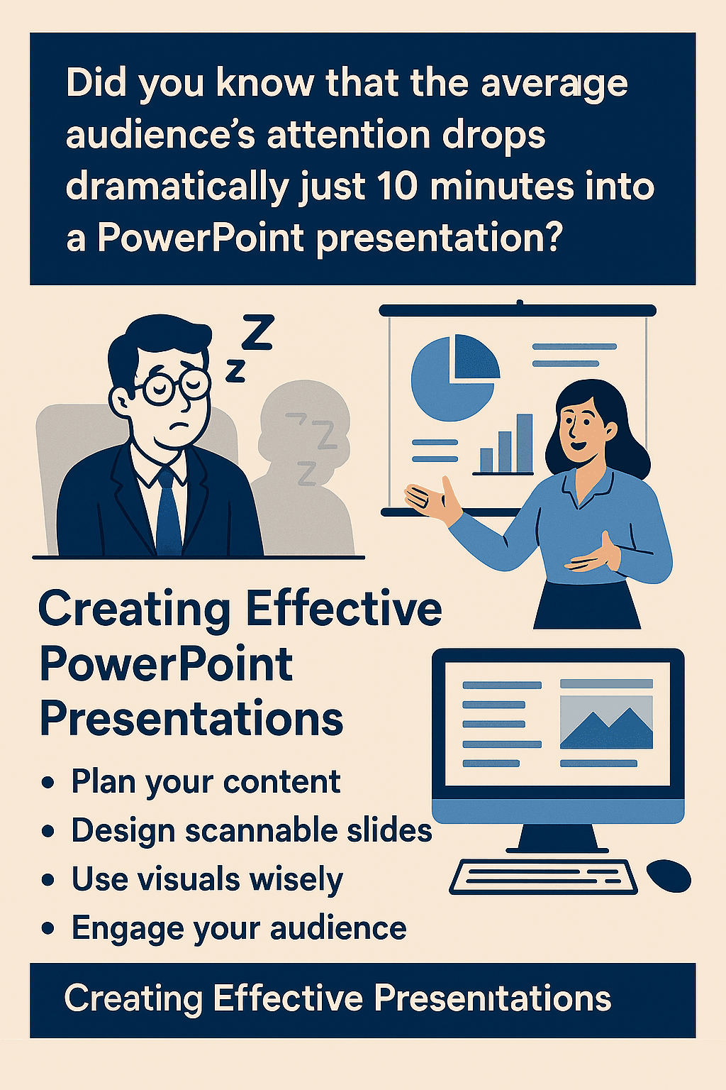

Did you know that the average audience’s attention drops dramatically just 10 minutes into a PowerPoint presentation?
Creating an effective PowerPoint presentation is actually more challenging than most people realize. We’ve all been there – trapped in a conference room while someone clicks through endless text-heavy slides, reading verbatim in a monotone voice. Unfortunately, this describes about 90% of business presentations today.
But your presentations don’t have to put people to sleep. In fact, with the right approach, your PowerPoint can become a powerful tool that enhances your message rather than distracting from it.
That’s why this guide focuses on practical strategies for creating presentations that engage your audience from start to finish. We’ll cover everything from planning your content before touching PowerPoint, designing scannable slides, using visuals strategically, avoiding common design pitfalls, and delivering with confidence.
Whether you’re preparing for a business meeting, classroom lecture, or conference talk, these techniques will help transform your next presentation from a potential snoozefest into a memorable experience that keeps your audience alert and engaged.
Plan Your Content Before You Design
The most common mistake presenters make occurs long before they open PowerPoint. Many people jump straight into designing slides without having a clear direction. Consequently, they end up with visually appealing but substantively weak presentations.
Plan Your Content Before You Design
Success begins with thoughtful planning. A well-structured presentation helps your audience follow your ideas easily and keeps them engaged from start to finish [1]. When you plan strategically, you create a presentation that delivers your message effectively instead of drowning in unnecessary details.
Define your core message
A core message is a simple sentence that clearly summarizes the essence of your presentation [2]. It serves as the foundation for everything you’ll present. Think of it as the headline for your entire talk – something that sticks with your audience long after the presentation ends [3].
To create an effective core message:
- Answer this question in 10 words or less: “If my audience remembers nothing else, what is the one idea I want them to recall and repeat?” [2]
- Keep it simple and avoid jargon or technical terms
- Ensure it describes the essence of your entire talk [2]
- Make it specific and straightforward [3]
Remember that your core message is the anchor that keeps your presentation from drifting off course. Everything you present—from your data to your visuals—should reinforce this key idea [3]. Without a clear core message, your audience might leave wondering, “What was that all about?” or “What am I supposed to do with this information?” [2]
Know your audience and their expectations
Understanding who will be sitting in those chairs fundamentally shapes how you should design and deliver your presentation. Audience analysis involves identifying your audience and adapting your speech to their interests, understanding level, attitudes, and beliefs [4].
Consider these crucial factors:
First, demographic information matters. Age, education level, occupation, and technical knowledge significantly influence how information will be consumed [5]. Furthermore, assess what prior knowledge your audience already has about your topic to avoid over-explaining basics or using unfamiliar terminology [4].
Additionally, understand their key concerns and goals. Every leader has something that keeps them up at night. If your presentation addresses those concerns, you’ll have their full attention [5]. Ask yourself: “What are the top three questions they want answered?” [5]
The setting and size of your audience also impact your approach. The way you speak to ten students differs dramatically from addressing 300 business owners [5]. Larger audiences typically require more formal presentations [4].
Outline your key points before opening PowerPoint
Once you understand your core message and audience, create an outline. This organizational tool helps you brainstorm ideas, organize content, and manage time effectively [1].
An outline focuses your presentation and gives you freedom to arrange ideas efficiently. By seeing everything side-by-side, you can eliminate points that don’t contribute to your overall message [1]. PowerPoint even offers an Outline View tool that can streamline this process.
Start by choosing an appropriate structure based on your goals:
- Chronological: For historical information or step-by-step processes
- Problem/solution: When persuading your audience to adopt specific solutions
- Compare and contrast: For discussing pros and cons of various options
- Topical: When organizing by theme or related topics [1]
Many experienced presenters recommend creating your outline in Word before opening PowerPoint [1]. This approach ensures your content drives the presentation rather than being limited by slide design constraints.
Planning thoroughly before designing saves time and creates more impactful presentations. When you understand your core message, audience expectations, and have a solid outline, your slides will naturally become more focused and effective.
Design Slides That Are Easy to Follow
Clear visual design is the bridge between your well-planned content and your audience’s understanding. Even the most compelling information gets lost when slides are cluttered or difficult to read.
Design Slides That Are Easy to Follow
Use large, readable fonts
Font selection and size dramatically impact how well your audience processes information. Generally, nothing smaller than 24-point font should appear on your slides, though 30-point is even better for ensuring visibility from any position in the room [6]. This size difference is particularly significant for those with visual impairments.
Sans-serif fonts like Verdana, Tahoma, and Calibri work exceptionally well for presentations. Verdana, specifically designed for digital screens, features widely spaced characters with tall lowercase letters, making it ideal for small text elements like footnotes or references [7]. Tahoma offers a slightly narrower, more formal alternative while maintaining excellent clarity [7].
Avoid script fonts, italics, and decorative typefaces entirely, regardless of how stylish they might appear. These fonts severely compromise readability and distract your audience from your message [8].
Stick to one idea per slide
Perhaps the most powerful design principle is limiting each slide to a single, focused concept. One central idea per slide helps audience members quickly grasp your point and prevents cognitive overload [9]. This approach enhances understanding, increases information retention, and promotes effective communication [10].
Breaking complex concepts into manageable pieces allows your audience to process information progressively. Subsequently, they’ll be prepared to understand the complete picture once you’ve dedicated time to each component [9]. For technical information, consider introducing smaller units before building up to the entire diagram or concept.
Unlike text-heavy slides that cause audiences to zone out, single-idea slides keep viewers engaged throughout your entire presentation. Moreover, this approach demonstrates that you truly understand your material and aren’t relying on slides as teleprompters [11].
Apply the 6×6 rule for bullet points
The 6×6 rule provides a helpful framework for creating scannable slides:
- No more than 6 bullet points per slide
- No more than 6 words per bullet point [6]
This guideline ensures your slides remain readable yet informative. Too much text on one slide appears boring, and nobody will read it [12]. Furthermore, limiting text per slide encourages the use of visuals—images, diagrams, charts—that support and enhance your presentation quality [12].
Although some view the 6×6 rule as somewhat outdated, the underlying principle remains valid: keep your slides from becoming so dense that people don’t want to look at them [13]. The human brain struggles to listen and read simultaneously, so minimal text prevents cognitive overload [14].
Use consistent slide templates
Consistency throughout your slide deck creates a professional, cohesive presentation. Uniform font styles, colors, and themes help your audience focus on content rather than adjusting to changing design elements [14].
Starting with templates often simplifies this process. Microsoft Create and other resources offer hundreds of pre-designed, customizable PowerPoint templates with predetermined fonts and color schemes [14]. These professionally designed templates meet current visual standards while saving considerable preparation time [15].
When all your slides maintain visual consistency, your audience can concentrate on your message instead of being distracted by jarring design changes between slides. This visual coherence strengthens your overall presentation impact and enhances audience retention of your key points.
Use Visuals That Support Your Message
Visuals serve as the powerhouse of any effective PowerPoint presentation, often communicating concepts more efficiently than text alone. When selected thoughtfully, they enhance audience understanding and create lasting impact.
Choose high-quality images over clipart
Nothing damages your professional credibility faster than blurry, pixelated images in your presentation [16]. Modern audiences expect sleek, contemporary visuals rather than dated or cartoonish designs that were common in older PowerPoint versions.
PowerPoint no longer includes traditional clipart. Instead, Microsoft 365 subscribers have access to several high-quality alternatives including professional photographs, icons, cutout people, stickers, and illustrations [17]. To access these resources, simply select Insert > Pictures > Stock Images to browse your options.
For maximum visual impact, ensure all images maintain high resolution. Beginning with Office 2016, PowerPoint includes a “High fidelity” image resolution option that allows minimal compression for optimal rendering on high-resolution displays [18]. This setting ensures pictures aren’t compressed unless they exceed the document canvas size.
Use charts and graphs to simplify data
Charts transform complex numerical information into easily digestible visuals. The right chart type depends entirely on what you’re trying to communicate:
- Column/bar charts: Ideal for comparing quantities or categories
- Line charts: Perfect for showing trends over time
- Pie charts: Best for displaying parts of a whole
- Waterfall charts: Excellent for demonstrating how values change through increases and decreases [19]
To create a chart in PowerPoint, click Insert > Chart and select the appropriate type [20]. For data-heavy presentations, consider creating your charts in Excel first, then copying them into PowerPoint – especially if your data changes regularly and you want charts to reflect the latest numbers.
Importantly, keep charts simple and focused. Avoid excessive decimal places in labels [2], and ensure all elements remain readable from the back of the room [3].
Avoid clutter and visual overload
White space isn’t empty space – it’s a deliberate design element that helps emphasize important content [21]. Resist the temptation to fill every inch of your slides with content. Instead, embrace minimalism to guide audience focus toward key points.
Follow these principles to minimize visual overload:
- Limit yourself to 1-2 images per slide [3]
- Choose muted, subtle visuals that complement rather than compete with your words [16]
- Maintain consistent colors throughout charts and graphs [3]
- Eliminate unnecessary elements like borders, gridlines, and decimal numbers [2]
Remember that visuals should support your message, not become “the star of the show” [22]. Effective visual elements bolster your core message without overshadowing it, creating a balanced presentation that keeps your audience engaged throughout.
Avoid Common Design Mistakes
Even the most brilliant content can fall flat due to preventable design missteps. Small design choices often determine whether your audience remains engaged or mentally checks out during your presentation.
Don’t use too many transitions or animations
Animations and transitions should enhance your message, not distract from it. Research shows that excessive animation overwhelms viewers and pulls attention away from your core content. Professional presenters recommend using only 1-2 different animation styles throughout an entire presentation [23].
When implementing animations:
- Choose simple, professional transitions like Fade or Push
- Apply animations purposefully to emphasize key points
- Avoid rapid animations that could cause discomfort for viewers with visual sensitivities [24]
Remember that animations should serve specific purposes within your design rather than functioning as mere visual embellishments [25]. The human eye naturally picks up movement, hence unnecessary motion simply diverts audience focus from your message [4].
Avoid low-contrast color combinations
Poor color contrast ranks among the most common accessibility mistakes in presentations, making content difficult to read for many viewers [5]. Nearly 8% of men and 0.5% of women experience color vision deficiency, potentially excluding significant portions of your audience [5].
For text legibility, maintain a contrast ratio of at least 4.5:1 between text and background colors [26]. Never combine bright blues with reds or mix reds with greens—these combinations create visual discomfort and are particularly problematic for colorblind viewers [27].
Similarly, avoid placing text over busy backgrounds or images. Dark text on light backgrounds (or vice versa) provides optimal readability [28]. Remember that red text tends to wash out when projected, particularly in rooms with ambient light [27].
Limit the number of fonts and colors
Design consistency creates a professional impression. Using too many fonts fragments your presentation’s visual unity and appears disorganized. Stick to a maximum of two complementary fonts—one for headings and one for body text [29].
For colors, choose a harmonious palette that aligns with your message. Bright colors can stimulate dopamine release, making audiences more engaged [30]. Nevertheless, limit your color selection to create visual harmony:
- Use neutral colors like white, gray, and black to balance brighter hues
- Apply color strategically to emphasize important points
- Maintain consistency throughout your slides
By avoiding these common design pitfalls, you create presentations that maintain audience attention while effectively communicating your message.
Deliver Your Presentation Like a Pro
A beautifully designed presentation still fails if delivered poorly. The final step—your actual delivery—often determines whether your audience stays engaged or mentally checks out.
Practice with your slides, not from them
Seasoned presenters don’t use slides as teleprompters. Practice enough to know your content thoroughly, allowing slides to simply complement your delivery [31]. When presenting, never turn your back to read from the screen—this immediately disconnects you from your audience [1]. Remember that you and your speech are the presentation; slides merely aid your storytelling [32].
Use the B key to pause and refocus attention
The “B” key might be PowerPoint’s most underutilized tool. Pressing it instantly blacks out the screen, directing all attention back to you [33]. Use this technique when making crucial points, transitioning between topics, or telling an important story [34]. For maximum impact, press B, lower your voice, and move toward your audience [33]. Alternatively, the “W” key produces a white screen, creating the same refocusing effect [35].
Engage with eye contact and movement
Maintain proper eye contact across the entire room—from left to right and front to back [1]. Avoid focusing exclusively on one section or just the front row [1]. Modify your voice inflection and tone throughout your presentation to make key points more memorable [32]. Position yourself beside the screen, not in front of it, ensuring you remain visible throughout [1].
Leave time for questions at the end
Establish upfront when you’ll take questions—either at the conclusion or after specific sections [14]. When someone asks a question, maintain eye contact and acknowledge them positively [36]. For large rooms, repeat questions so everyone can hear before answering [36]. If time runs short, offer to continue discussions afterward [36]. Always remain gracious with critical questions, separating valid criticism from personal attacks [36].
Conclusion
Creating powerful PowerPoint presentations requires thoughtful planning, deliberate design choices, and confident delivery. Therefore, your efforts should begin long before opening the software, focusing first on defining your core message and understanding your audience’s needs.
Effective slides follow simple principles that enhance readability. Large fonts, single ideas per slide, and the 6×6 rule for bullet points collectively ensure your audience can easily process information without becoming overwhelmed. Additionally, consistent templates maintain professionalism throughout your presentation.
Visuals undoubtedly transform abstract concepts into memorable experiences when used strategically. High-quality images, relevant charts, and appropriate white space work together to emphasize key points rather than distract from them. The right visual elements support your message without overshadowing your words.
Common design pitfalls can derail even well-planned presentations. Excessive transitions, poor color contrast, and too many fonts create visual chaos that pulls attention away from your content. Simplicity and consistency remain your strongest allies in slide design.
Finally, mastery extends beyond slide creation to actual delivery. Practice thoroughly, use the B key to refocus attention, maintain engaging eye contact, and manage question periods professionally. These delivery techniques distinguish average presenters from exceptional communicators.
Remember, PowerPoint serves as a tool that enhances your message rather than delivers it for you. Your audience came to hear you speak, not to read slides. The next time you prepare a presentation, apply these principles from planning through delivery. After all, your goal isn’t just to inform but to engage, persuade, and perhaps most importantly, keep everyone wide awake.
References
[1] – https://www.niu.edu/presentations/deliver/index.shtml
[2] – https://www.chillibreeze.com/presentation-design/things-you-should-know-when-designing-charts-in-powerpoint/
[3] – https://www.student.unsw.edu.au/design-tips
[4] – https://tomorrowsva.com/using-animations-and-transitions-for-polished-presentations/
[5] – https://www.brightcarbon.com/blog/free-color-contrast-checker-for-powerpoint/
[6] – https://www.microsoft.com/en-us/microsoft-365-life-hacks/presentations/10-20-30-rule-of-powerpoint
[7] – https://www.brightcarbon.com/blog/10-best-presentation-fonts/
[8] – https://www.superside.com/blog/best-powerpoint-fonts
[9] – https://pmc.ncbi.nlm.nih.gov/articles/PMC8638955/
[10] – https://www.slidegenius.com/blog/the-importance-of-having-one-point-per-slide-and-how-to-do-it
[11] – https://www.stinsondesign.com/blog/one-point-per-slide
[12] – https://www.wps.com/blog/6×6-powerpoint-rule-what-is-it-and-how-to-use-it/
[13] – https://www.forbes.com/sites/propointgraphics/2017/07/05/debunking-the-presentation-6×6-rule/
[14] – https://www.microsoft.com/en-us/microsoft-365-life-hacks/presentations/how-to-handle-questions-and-objections-during-presentation
[15] – https://slidemodel.com/best-powerpoint-templates/
[16] – https://blog.thenounproject.com/a-guide-to-using-images-and-photos-for-powerpoint/
[17] – https://support.microsoft.com/en-au/office/add-clip-art-to-your-file-0a01ae25-973c-4c2c-8eaf-8c8e1f9ab530
[18] – https://support.microsoft.com/en-au/office/change-the-default-resolution-for-inserting-pictures-in-office-f4aca5b4-6332-48c6-9488-bf5e0094a7d2
[19] – https://plusai.com/blog/how-to-create-a-graph-in-powerpoint
[20] – https://support.microsoft.com/en-au/office/use-charts-and-graphs-in-your-presentation-c74616f1-a5b2-4a37-8695-fbcc043bf526
[21] – https://learn.aippt.com/how-to-make-your-powerpoint-slides-visually-engaging-without-overdoing-it/
[22] – https://www.anu.edu.au/students/academic-skills/writing-assessment/presentations/working-with-visual-aids
[23] – https://support.microsoft.com/en-au/office/video-animations-and-transitions-07a941fb-b027-4f3e-b514-cd9866723f45
[24] – https://www.rekarda.com/blog/mastering-powerpoint-animation-best-practices-tips-and-common-pitfalls
[25] – https://www.verdanabold.com/post/the-do-s-and-dont-s-of-powerpoint-animation
[26] – https://accessible-communications.com/take-the-21-day-challenge/day-11-use-color-contrast-in-powerpoint/
[27] – https://support.microsoft.com/en-au/office/combining-colors-in-powerpoint-mistakes-to-avoid-555e1689-85a7-4b2e-aa89-db5270528852
[28] – https://learn.aippt.com/powerpoint-design-using-color-and-contrast-for-effective-communication/
[29] – https://www.ideaseed.com.au/insights/10-common-mistakes-to-avoid-in-presentation-design
[30] – https://www.peregrinecommunications.com/insights/common-mistakes-powerpoint-presentations
[31] – https://support.microsoft.com/en-au/office/tips-for-creating-and-delivering-an-effective-presentation-f43156b0-20d2-4c51-8345-0c337cefb88b
[32] – https://slidemodel.com/23-powerpoint-presentation-tips-creating-engaging-interactive-presentations/
[33] – https://www.linkedin.com/pulse/b-key-single-most-useful-tool-powerpoint-peter-cohan
[34] – https://qceptpresentations.com/blog/powerpoint-b-key-presentation-tip/
[35] – https://support.microsoft.com/en-au/office/use-keyboard-shortcuts-to-deliver-powerpoint-presentations-1524ffce-bd2a-45f4-9a7f-f18b992b93a0
[36] – https://www.niu.edu/presentations/questions/index.shtml


